
[et_pb_section][et_pb_row][et_pb_column type=”4_4″][et_pb_text admin_label=”Text” background_layout=”light” text_orientation=”left”]
Store Website with Bootstrap
[/et_pb_text][/et_pb_column][/et_pb_row][et_pb_row][et_pb_column type=”2_3″][et_pb_text admin_label=”Text” background_layout=”light” text_orientation=”left”]
Design First
First, use a drawing program (Keynote is actually a favorite of web designers) to mock up your website. Use a 12 column design, so that you can use Bootstrap later to turn your design into reality. Your mockup doesn’t have to be perfect, but should show the rows and columns and give an indication of what you’re going to put in each spot.
Set up your Bootstrap Website.
Start with the Bootstrap template code. You can copy and paste them from the Bootstrap website.
What these lines do is to copy the CSS and Javascript your website needs from remote servers. You can download and include the bootstrap files on your own server, but this is an easier way to get started.
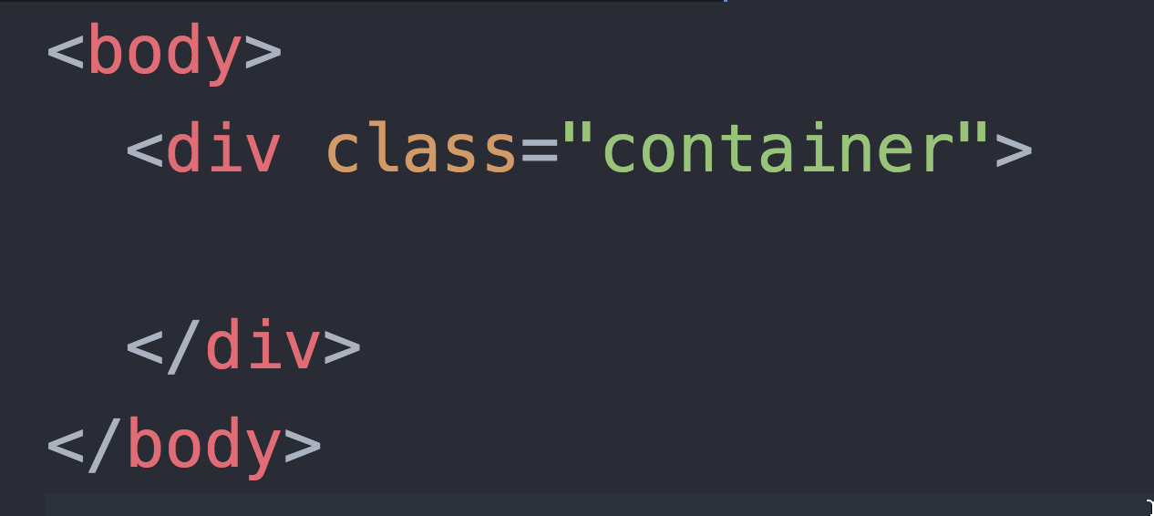
Make your container, row, and column divs.
The next step is to make the structure of your website with rows and columns. The whole thing should be inside a container div, like this:
Inside the container div, make as many rows as you need. I’ll make three rows, but you might have more.
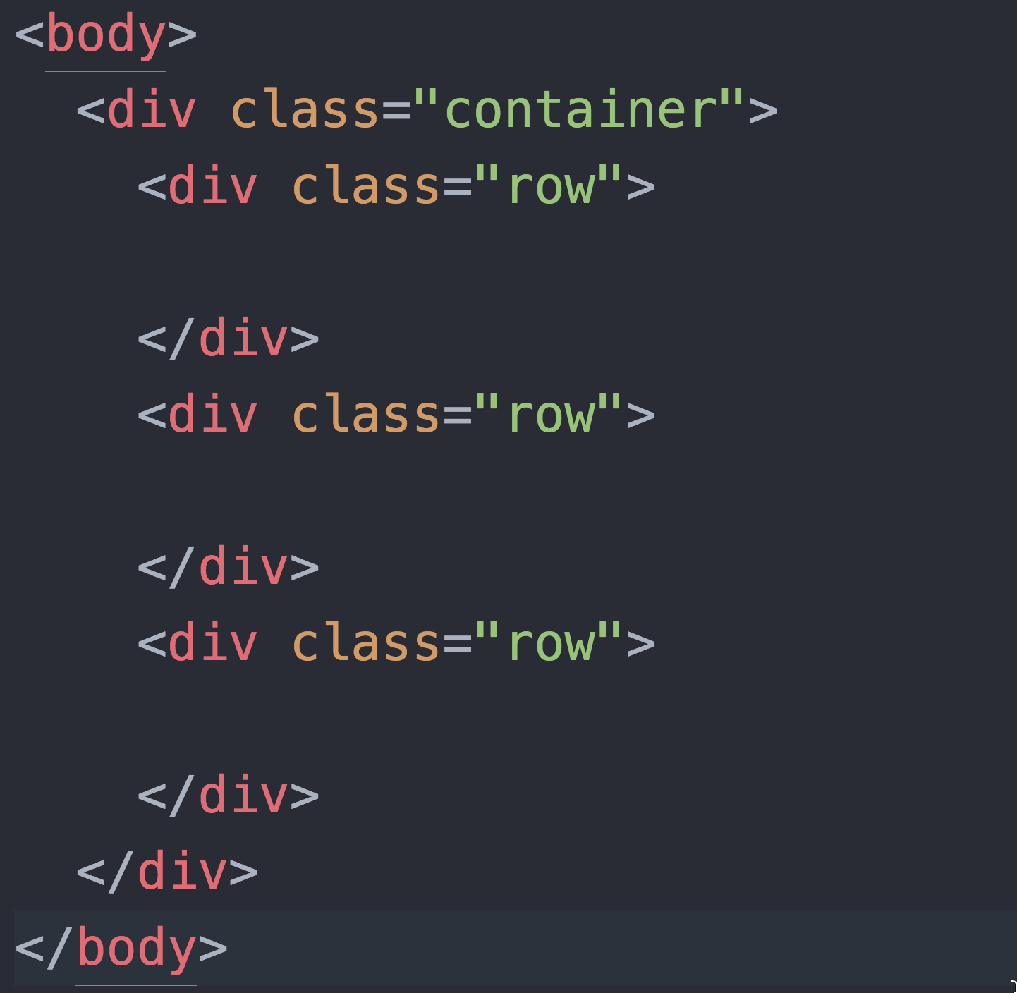
Each row should be broken up into columns. Here is where the 12-column model comes in. In each row, the number of columns should add up to 12. Say my first row has just one box, the whole way across. Then that row might look like this:
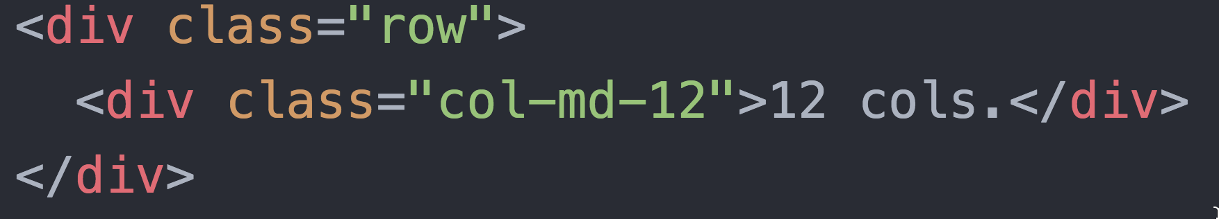
The “md” stands for medium, which doesn’t mean anything here, but will when we have more boxes.
Our next row has two boxes, one which is twice as wide as the other. That row would look like this:
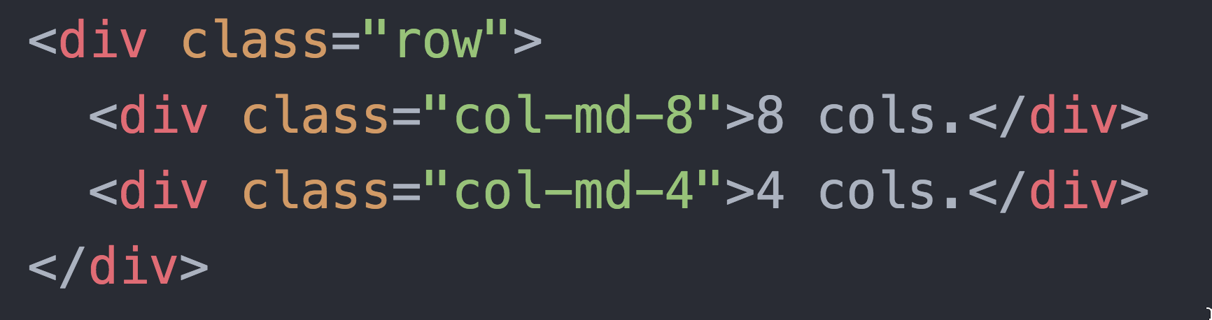
Try making the third box into 6 2-column boxes.
Fill in the content.
Use more divs of your own inside the column divs to add content, if you want to style content with classes.
Use Bootstrap Components
Use Bootstrap components to assemble your site. Use a nav bar – the same one on each of your pages.
Project Requirements
You should make three pages. One should be a “home page” for your store. One should be a product page – a page for one thing you are selling. The third page should have a form that lets the user “buy” something – obviously they can’t really buy anything, but it should look like they can. Use Bootstrap components for everything, including the form.
Use at least five different Bootstrap components. Make sure all your content is in components.
Make sure your website remains “responsive” – looks good on both full width and mobile devices.
Some of your links can go nowhere – use <a href=”#”> for this. This way you can have a full front page without making dozens of other pages.
To do more:
Use a carousel with carefully edited images, so that the whole thing stays stable.
Use a modal – modal forms work well.
Use other interactive features, like accordions or tabs.
[/et_pb_text][/et_pb_column][et_pb_column type=”1_3″][et_pb_text admin_label=”Text” background_layout=”light” text_orientation=”left”]
Resources
We’re using Bootstrap 4, make sure you’re not looking at Bootstrap 3 docs!
[/et_pb_text][/et_pb_column][/et_pb_row][/et_pb_section]